
The Brain Food Club
Brand strategy, visual identity, and editorial direction for a nutrition and focus coaching brand built on humor, intelligence, and sustainable daily habits.
Brand Strategy
Positioning, Voice & Audience Architecture
Visual Identity
Logo, Color System & Typography
Editorial Direction
Book Cover, Social Templates & Content System
Portfolio Concept
Speculative Direction · Lisa Calderón
The Brief
A nutrition brand that needed to feel smart without feeling clinical.
Lisa Calderón is a nutrition and focus coach, author, podcast host, and speaker. The Brain Food Club is her platform — and it needed a brand that could hold all of it: the book, the podcast, the workshops, the social presence, and the coaching practice. The brief was to build a visual identity and content system that felt warm, intelligent, and distinctly hers.
* This is a portfolio concept. The Brain Food Club is a real brand; this case study represents a speculative identity direction developed by Cocotasos Creative.
Scope of Work
The Challenge
Smart, warm, and practical — without looking like a wellness brand.
Differentiate from the sea of green-juice aesthetics and clinical nutrition branding that dominates the wellness space.
Hold a multidisciplinary practice — author, coach, podcast host, speaker — under one coherent visual identity without flattening any of it.
Feel approachable and human, not aspirational or prescriptive. Lisa's voice is warm and funny — the brand needed to match it.
Travel across formats: book cover, podcast thumbnail, social grid, workshop slide deck, and live event backdrop — all reading as one brand.

The Approach
Build the identity from the voice, not the category.
The starting point wasn't nutrition — it was Lisa. Her tone is direct, funny, and genuinely curious. The identity needed to feel like her before it felt like a brand. That meant grounding the palette in natural, earthy tones that feel lived-in rather than clinical, and building a typographic system that could carry both editorial weight and everyday warmth.
Voice-first positioning — the brand sounds like Lisa before it looks like anything.
Earthy palette — olive, sage, terracotta, and gold instead of the expected greens and whites.
Editorial structure — a content system that organizes information without making it feel like a textbook.
Format flexibility — every asset designed to travel from digital to print to live without breaking.
Color System
A palette built for calm, clarity, and appetite.
Seven colors. Each one earns its place. Olive and sage anchor the system — grounded, natural, easy to live with. Terracotta adds energy without noise. Golden and blue-gray give the system range across print, digital, and merch without ever feeling clinical.
Logo Construction
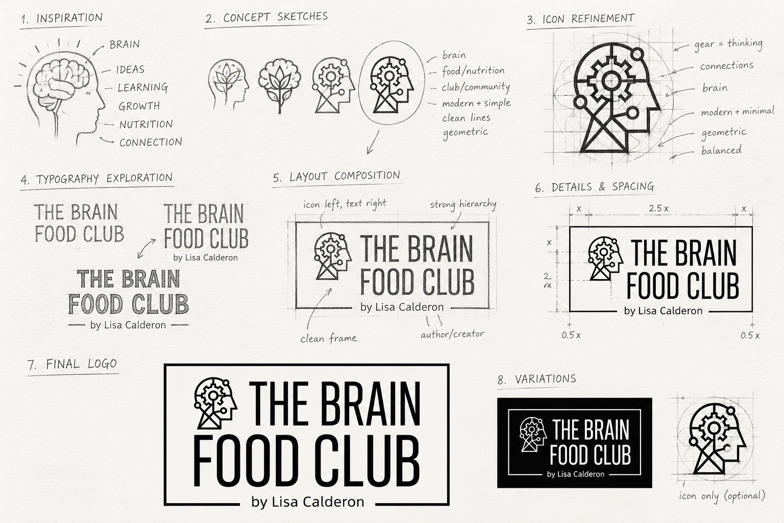
Brand Guidelines
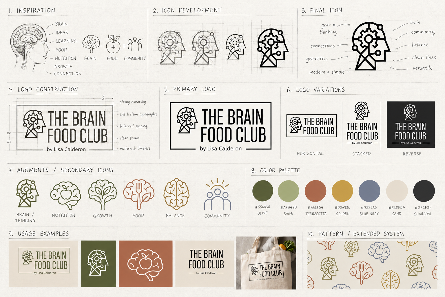



Visual Identity System
A system that can organize information and still feel human.
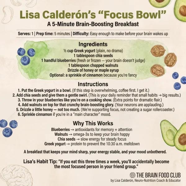
The Book
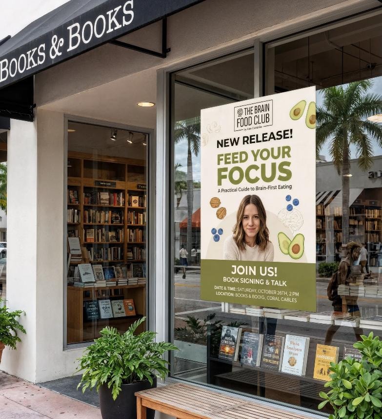
Feed Your Focus — a book that looks as good as the advice inside.
The book cover anchors the identity. It needed to feel like something you'd leave on your coffee table — not hide in a drawer. The design uses the full palette, a typographic hierarchy that signals intelligence without intimidation, and a layout that holds up in thumbnail, in hand, and on a bookstore shelf.
Content System
A system that can organize information and still feel human.
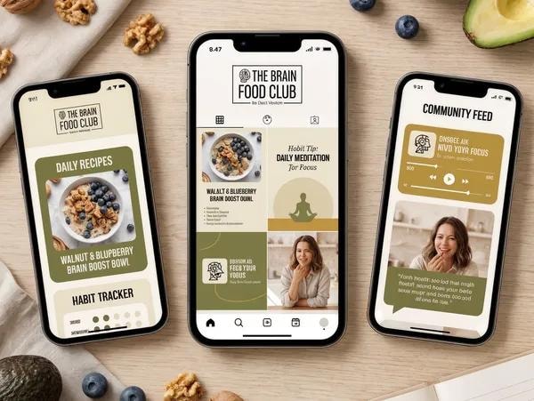
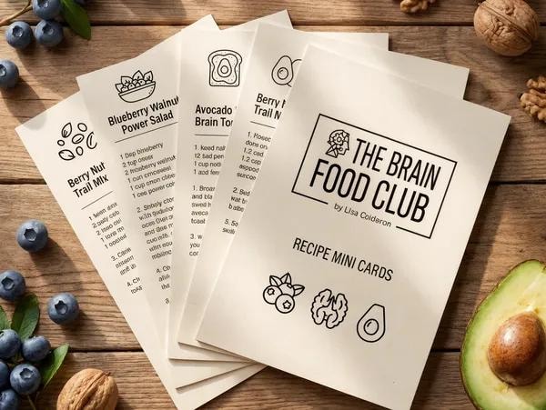
The content system was built to handle the full range of what Lisa publishes: habit tips, recipes, focus science, humor, and personal stories. Templates were designed for social, email, and digital — each one flexible enough to hold different content types while keeping the grid coherent and recognizably hers.

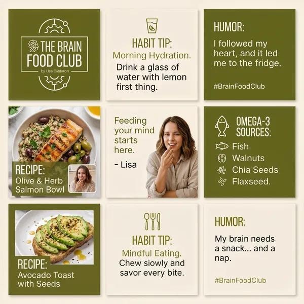
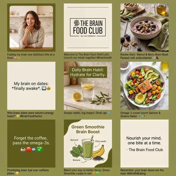
Social Templates
One grid. Every format.
Habit tips, recipes, humor, and omega-3 facts — all living inside the same visual system. The grid stays coherent without feeling rigid.
The Podcast
The Brain Food Club Podcast — where science meets your snack drawer.
Lisa hosts the show herself — same voice, same humor, same practical intelligence she brings to every workshop and coaching session. The brand needed to travel from a book cover to a podcast thumbnail to a mic-stand moment without losing a beat.
Author — Feed Your Focus
Host — The Brain Food Club Podcast
Speaker & Workshop Facilitator
Nutrition & Focus Coach
Live & Speaking
The same clarity on stage that she brings to the page.
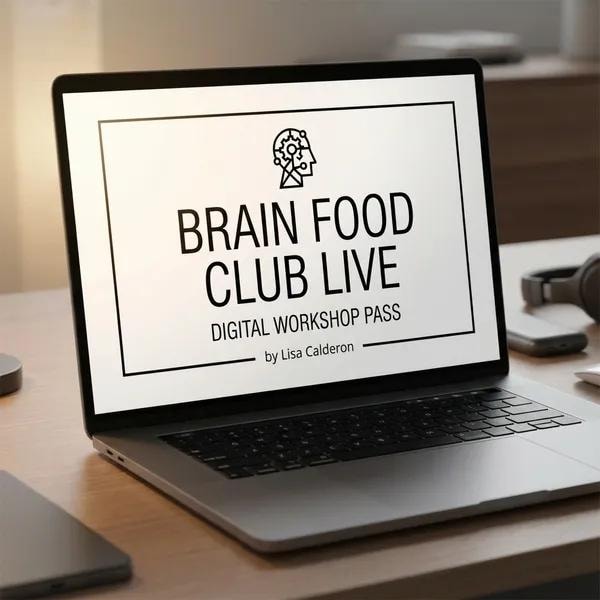
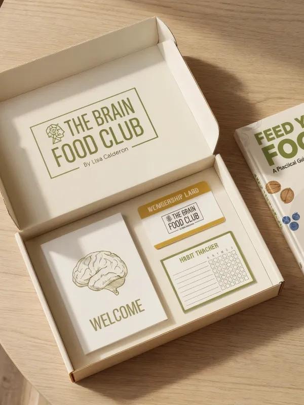
Lisa speaks at events, leads workshops, and facilitates coaching sessions — all under the same brand. The identity needed to hold up on a stage backdrop, a workshop slide deck, a digital pass, and a book signing table at Books & Books. It does.
Reflection
The best brand work disappears into the person it's built for.
The Brain Food Club is a brand that works because it doesn't try to be bigger than its founder. It amplifies what Lisa already is — smart, warm, practical, and a little funny — rather than imposing a visual language on top of her. That's the goal with every identity: build something that feels inevitable in retrospect.
* This is a portfolio concept developed by Cocotasos Creative. The Brain Food Club is a real brand and platform by Lisa Calderón.