Visual Identity · Creative Direction · Digital Experience
Naurys Hair Designs
Turning expert hair care into a private, ritual-led luxury experience.
Visual Identity
Wordmark, Color System & Typography Direction
Creative Direction
Photography Style, Tone & Brand Voice
Digital Experience
Website Architecture & Booking Journey
Coral Gables, FL
Founder-Led Salon · By Appointment Only
Project Overview
Naurys Hair Designs is a founder-led salon in Coral Gables built around personalized care, technical expertise, and an intimate by-appointment experience. The opportunity was to translate that level of attention into a brand and digital direction that felt elevated without becoming distant, and luxurious without losing the warmth of the founder behind it.
Cocotasos Creative developed the positioning, visual direction, content structure, and proposed website experience. The work was completed as a concept direction but was not launched because the client did not move forward with final content and domain connection.
The Challenge
The care was personal. The brand needed to feel that way.
Naurys offered more than a salon appointment. Her work was rooted in listening, technical knowledge, and an understanding of how hair affects confidence. But the business needed a clearer way to communicate that difference. The challenge was not simply to make the salon look more luxurious. It was to distinguish a private, care-led experience from the crowded visual language of beauty businesses: trend-driven imagery, generic glamour, and service menus with little sense of the person behind them. The brand needed to make expertise visible while preserving intimacy.

The Insight
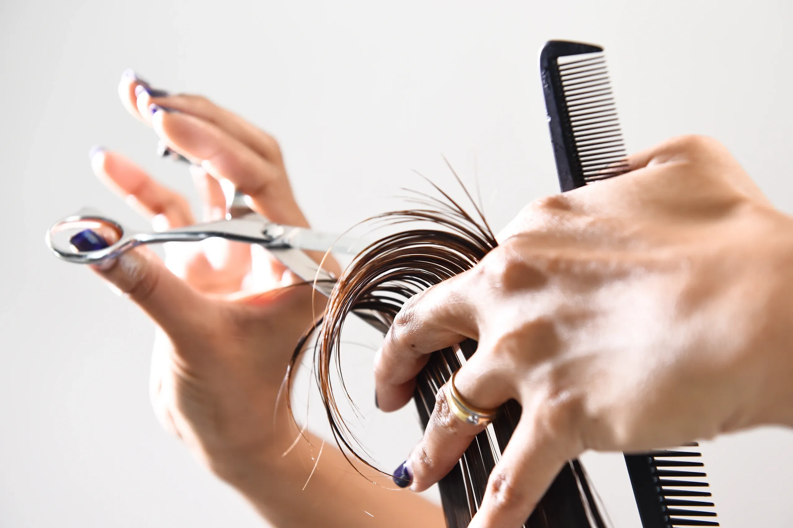
In beauty, luxury is often presented as appearance. Here, luxury was attention.
The strongest differentiator was not a hairstyle or a product. It was the way Naurys worked: by appointment, through conversation, with care tailored to the individual. That shifted the center of the brand from transformation alone to the relationship behind it. Instead of presenting the salon as a place where clients are styled, the direction positioned it as a private experience where clients are understood.
"Beauty begins with care."
The Strategic Idea
Turn the consultation into a ritual.
The central idea became The Consultation Ritual: a named expression of the care, expertise, and conversation that happen before the service itself. Naming the consultation transformed an ordinary operational step into a distinctive brand experience. It gave the business a clearer story, created useful educational content, and provided a natural bridge from first website visit to appointment request.
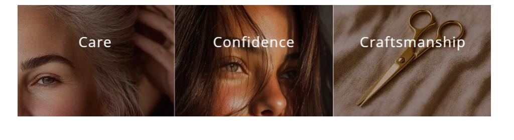
Care
Every interaction should feel personal, attentive, and free of judgment.
Confidence
The brand should help the client feel understood before asking her to change.
Craftsmanship
Expertise should be visible in the restraint, precision, and structure of every touchpoint.
Visual Identity
Editorial elegance with a human center.
The visual direction balances warmth and refinement. Deep burgundy creates intimacy and confidence; soft neutrals keep the experience calm; restrained metallic or rose-toned details add polish without turning decorative. Editorial typography gives the brand a sense of expertise and permanence, while expressive photography keeps the system personal. The result is designed to feel like the salon itself: private, considered, and centered on the individual.
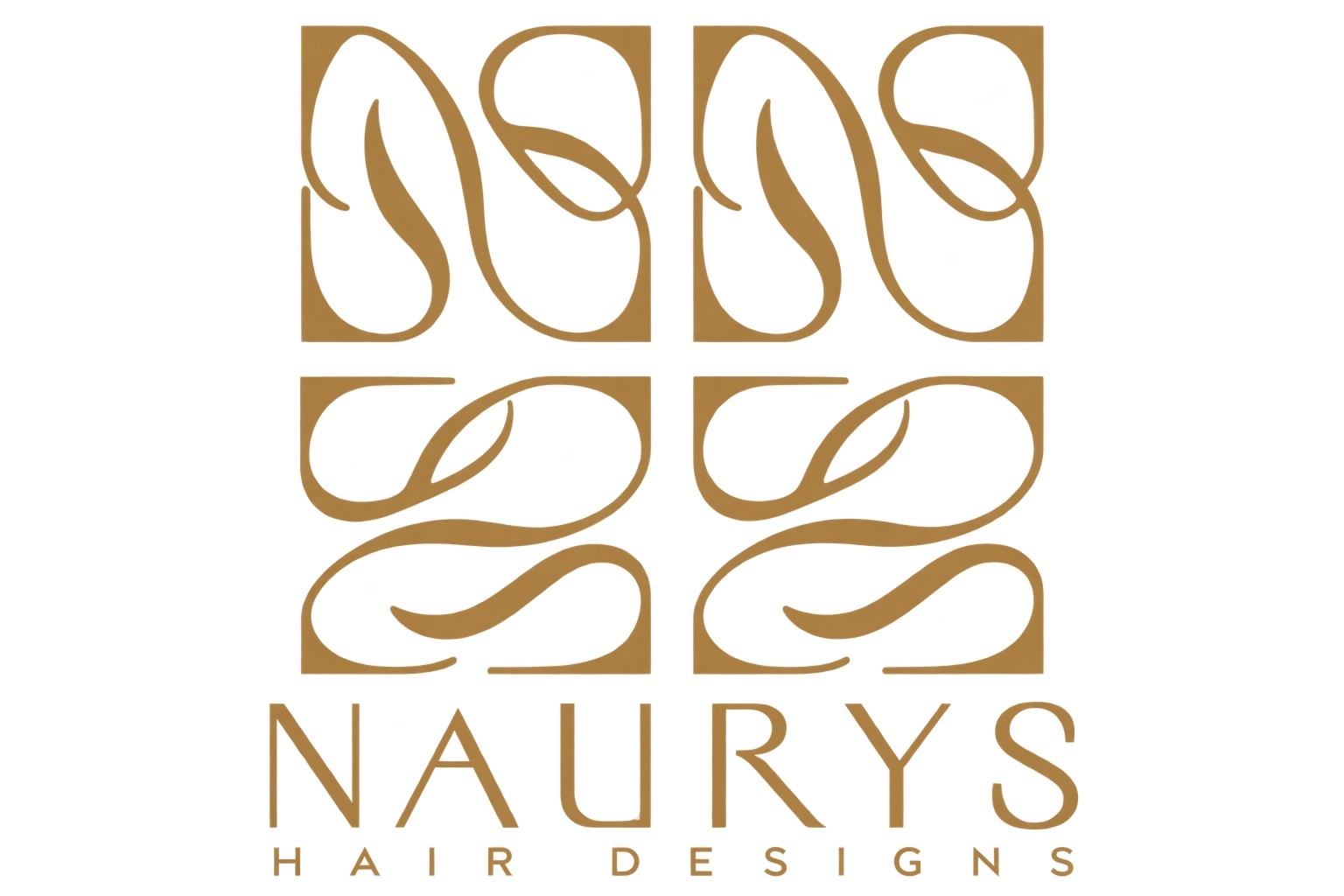
Primary logo
Associated sub-brand
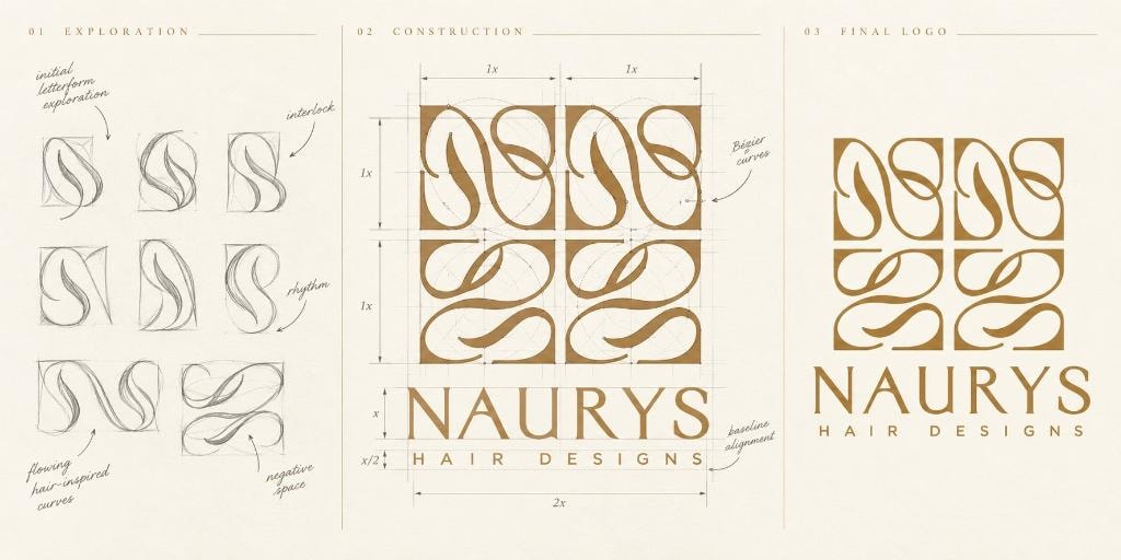
Naurys — logo exploration, construction & final mark
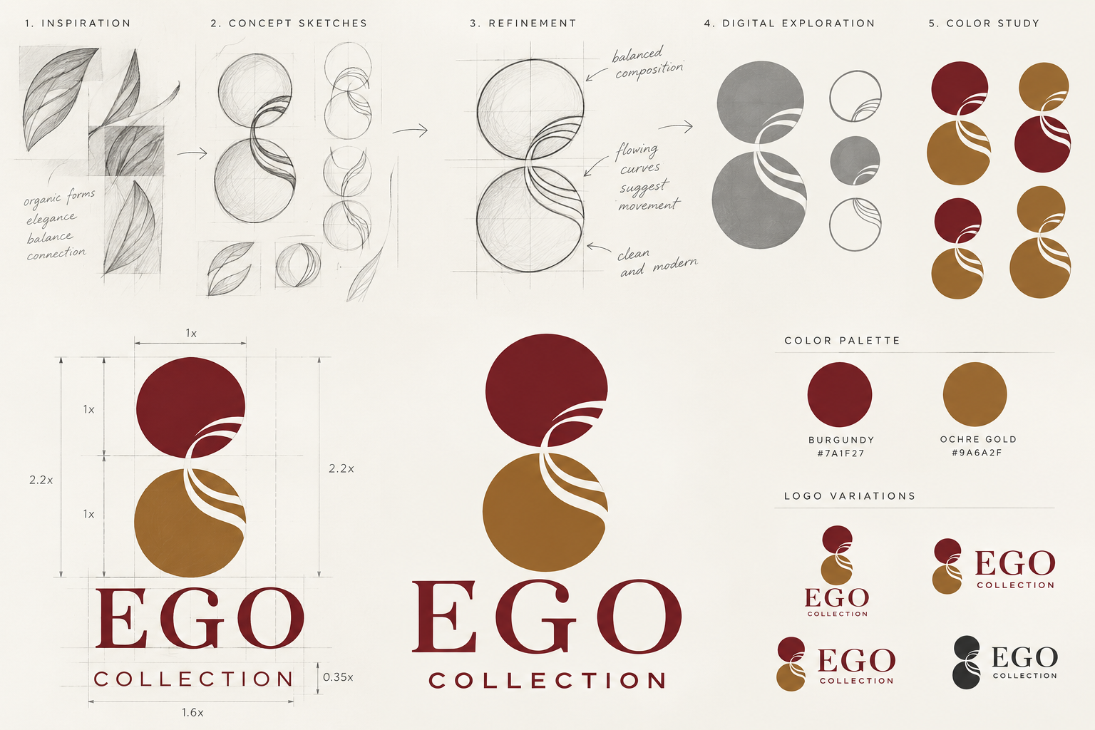
EGO Collection — logo design process
Brand palette
Ink
#141414
Burgundy
#4a1a24
Wine
#5e2a35
Terracotta
#8c4a35
Bronze
#a07848
Gold
#b09040
Blush
#c4909a
Cream
#f0e8dc
Brand icon system

The Digital Experience
From first impression to private appointment.
The proposed website was designed as more than a salon gallery. It combined founder story, education, portfolio imagery, booking pathways, and product recommendations in one coherent experience. Every page had a role: establish trust, make the philosophy tangible, answer questions, demonstrate expertise, or move the visitor toward a conversation.
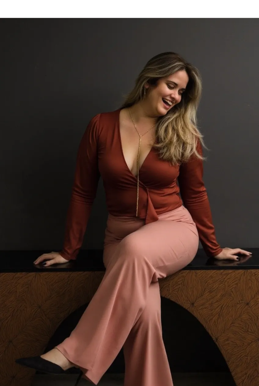
Key Experience Moments
The hero
A full-screen video or portrait of the founder at work. The first impression communicates care, expertise, and intimacy before a single word is read.
The philosophy statement
"Beauty Begins With Care" appears early and anchors the brand's point of view. It is not a tagline — it is a positioning statement that everything else supports.
The Ego Collection
Client transformations are presented as a curated portfolio, not a gallery grid. Each image is treated as a piece of work, not a before-and-after.
The Consultation Ritual page
A dedicated section that explains the process, answers common questions, and positions the consultation as the beginning of the experience — not a prerequisite to it.
The Proposed System
A brand that works across every surface.
The identity was designed to function across print, digital, and environmental applications. Every element — from the wordmark to the color palette to the typographic rhythm — was chosen to hold up at scale and remain recognizable in any context.





What This Demonstrates
Designing for a founder-led service business.
Translating a personal service into a brand identity that communicates expertise without losing warmth.
Developing a strategic idea — The Consultation Ritual — that gives the business a distinctive story and a natural content framework.
Building a visual system that works across digital, print, and environmental applications from a single coherent direction.
Structuring a website experience around a clear conversion goal: move a first-time visitor toward an appointment request.
This project was completed as a full concept direction for a real client. The work was not launched because the client did not move forward with final content and domain connection.
Reflection
The best service brands don't sell the service. They sell the relationship.
Naurys was a reminder that the most powerful differentiator in a founder-led business is often the founder herself. The work was not about making the salon look more expensive. It was about making the care visible — and giving it a name.
Concept direction for a real client · Designed end to end · Not launched