A brand built for athletes and the parents who believe in them.
Multi-sport youth performance identity, digital direction, and visual system.
Strategy
Brand Positioning & Audience Architecture
Identity
Logo, Color, Typography & Motion Language
Digital
Website Direction & UX Concept
Concept
Multi-Sport Youth Performance Program
The Challenge
A facility built for serious young athletes — without a brand to match.
Elevate Youth Performance Academy trains multi-sport youth athletes across disciplines. Their programming was rigorous. Their identity wasn't.
The academy needed a brand that could speak to two very different audiences simultaneously: the young athletes who would wear it, and the parents who would trust it. Too aggressive and parents hesitate. Too soft and athletes disengage.
The Insight
Performance is personal.
Youth athletes don't just want to get better — they want to feel like they belong to something. The brand needed to carry both the intensity of competition and the warmth of community.
"Bold enough for athletes. Considered enough for parents."

Strategic Idea
Built to move. Designed to last.
The strategic foundation centered on a single idea: that elite performance and inclusive community aren't opposites — they're the same thing at different scales.
The brand should make young athletes feel like they're part of something bigger than a single sport or season.
Parents need to see professionalism and care in every touchpoint — from the logo to the facility signage.
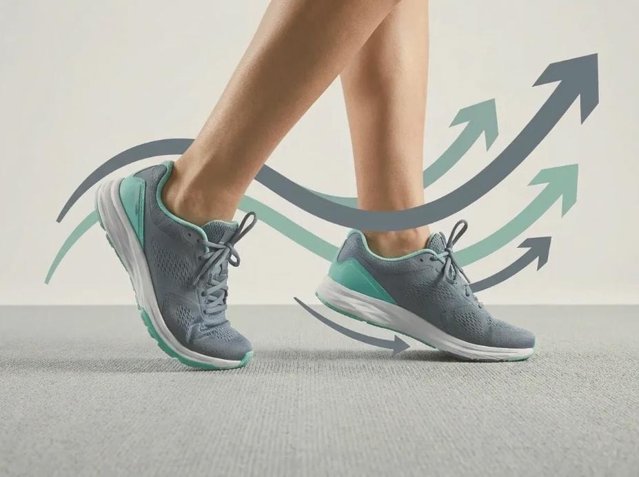
The visual language should feel kinetic — always implying forward movement, progress, and energy.
Visual Identity
A system built for speed and scale.
The identity draws from the geometry of athletic motion — directional forms, bold weight contrasts, and a palette that reads equally well on a jersey, a wall, and a screen.
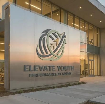
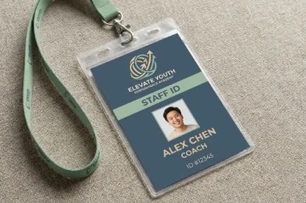
An upward-angled wordmark with a dynamic slash element — readable at any size, from a staff badge to a building facade.
Navy anchors authority. Teal signals energy and forward motion. Orange activates — used sparingly for moments that demand attention.
A geometric sans-serif for headlines carries the athletic tone. A clean secondary face handles all instructional and informational copy.
Directional arrows and diagonal crop lines create a consistent sense of momentum across all applications.
Palette
Navy
Steel
Teal
Mint
Orange
Sand
Charcoal
White
Identity in Context
From the court to the community.
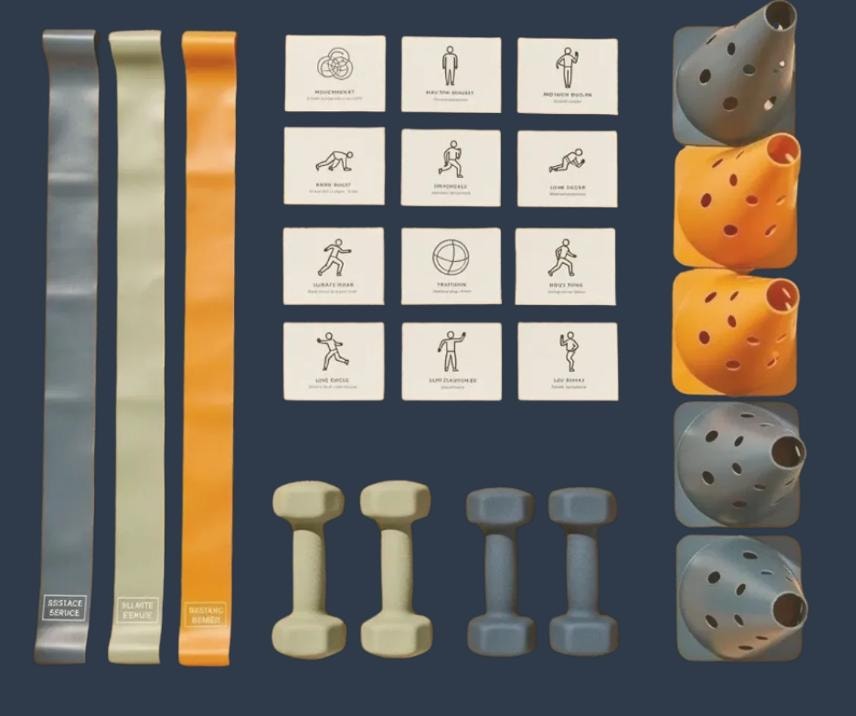
The system was designed to work across every surface an athlete or parent would encounter — from the first impression to the everyday.
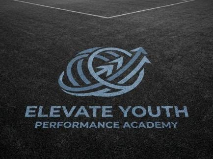
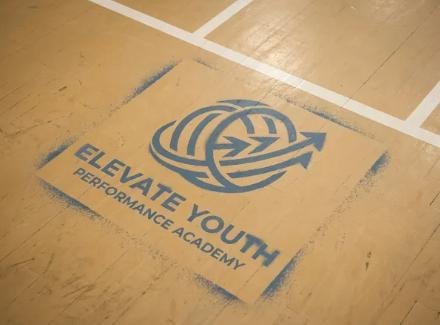
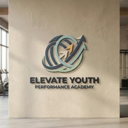
Large-format applications on walls, courts, and building exteriors. The mark holds at scale without losing legibility or energy.
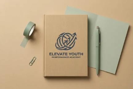
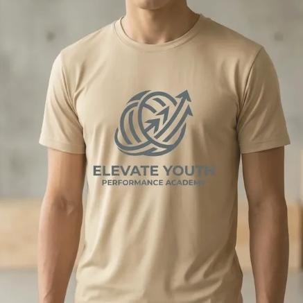
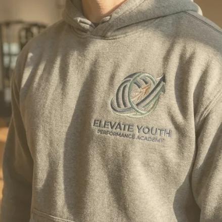
Staff uniforms, athlete gear, and merchandise. The palette and mark system translate cleanly to embroidery, screen print, and sublimation.
Website direction and social templates built from the same grid and motion language as the physical identity.
Apparel and merchandise — concept mockups

Digital Direction
A website that recruits.
The digital concept was built around a single conversion goal: get a parent to schedule a visit. Every section was designed to answer the question they're actually asking.
Who are you?
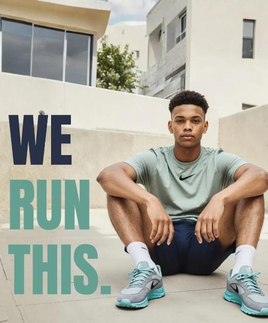
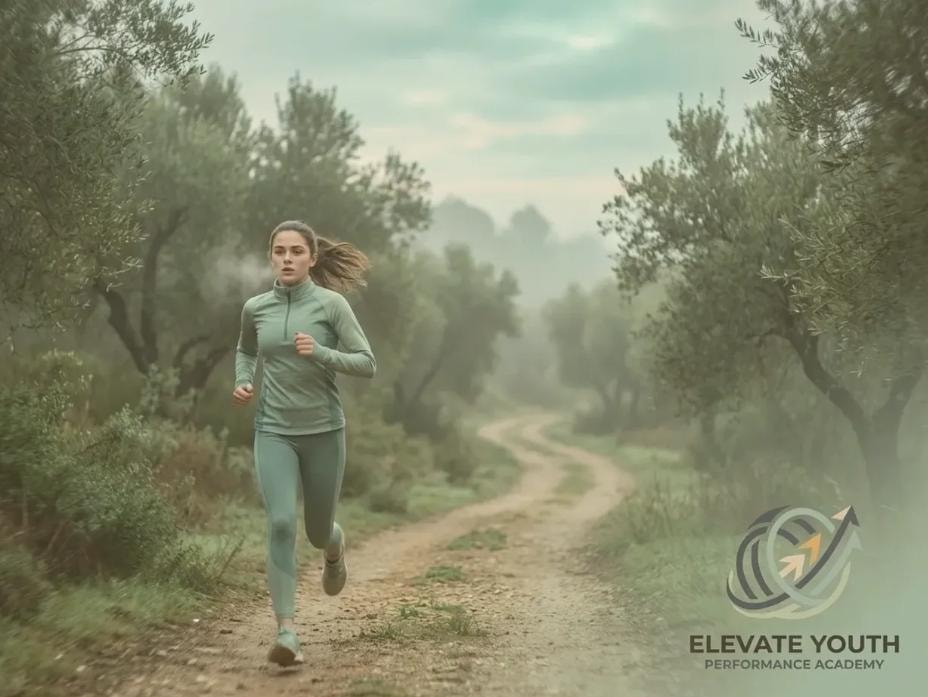
The hero establishes the academy's identity and energy in under three seconds.
What do you offer?
Programs are presented by sport and age group — clear, scannable, and parent-friendly.
Can I trust you?
Credentials, coaches, and community proof points are surfaced early and often.
What's next?
A persistent CTA drives toward scheduling a visit — the single most important conversion action.

What This Concept Demonstrates
Designing for two audiences at once.
This project required holding two very different emotional registers simultaneously — and making them feel like one coherent brand.
Audience architecture: mapping the emotional needs of athletes and parents to distinct but aligned brand signals.
System thinking: building a mark and palette that scale from a staff badge to a building facade without losing integrity.
Motion language: creating a visual vocabulary that implies energy and progress across static and digital applications.
Conversion-led digital direction: structuring a website concept around the single most important parent action.


Reflection
"The best youth brands don't talk down to kids — or up to parents."
Elevate Youth was a reminder that the most interesting brand problems are the ones where the audience is genuinely split. The solution isn't to find the middle — it's to find the thing that both groups actually want, and build from there.
Concept work — not a live client engagement.