Conceptual Brand Direction
Engineering Consultants
"Where technical mastery meets human-centered design."
Strategy
Brand Positioning & Messaging
Identity
Logo, Color & Typography System
Digital
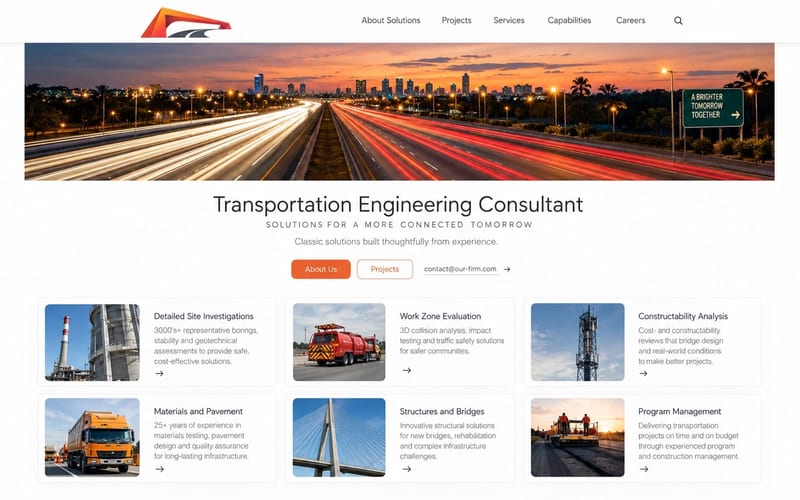
Website Design & Architecture
Concept
Women-Led Civil Engineering Firm
The Challenge
A firm built on expertise — invisible to the clients who needed them most.
Their existing materials conveyed information, but not identity. The goal was to articulate credibility with warmth — a brand that feels engineered yet human.
This conceptual direction was developed for a women-led civil and transportation engineering consultancy — a firm built on expertise, reliability, and discipline.
The goal was to evolve their visual presence into one that reflected both technical mastery and the character of the people behind it.
The challenge was to articulate credibility with warmth — a brand that feels engineered yet human, and a website that communicates trust before a single word is read.
Scope
- Brand Strategy
- Visual Identity
- Website Design
- Information Architecture
Type
ConceptualHow we made their expertise impossible to overlook
Three engagements. One destination.
| Strategy | Visual Identity | Digital Experience |
|---|---|---|
| Brand Positioning | Logo & Wordmark | Website Design & Development |
| Archetype Alignment | Color System | Information Architecture |
| Messaging Architecture | Typography System | Modular Content Frames |
| Audience & Tone Definition | Photography Direction | Practice Area Pages |
| Competitive Differentiation | Brand Guidelines | Proposal Templates |
| — | Extended Palette | Digital Communication System |
Creative Direction
Visual Evolution — From Structure to Symbol
The creative direction began with a single idea: clarity communicates strength. Inspired by the architecture of bridges — steel, sunlight, and motion — the visual language evolved around contrast and perspective. The result is a presence that feels engineered, but also alive.
Visual Evolution — From Structure to Symbol

01 / 08
01 — The source material
Inspiration
Highway infrastructure — the bridge arch, the vanishing road, the geometry of engineered span. The mark begins here.
Brand Palette
Deep Charcoal
#2C2C2A
Construction Orange
#D4622A
Soft Gray
#B8B4AC
Steel Blue
#4A6478
Warm White
#F5F2EC
Strategy & Design
Designed for trust before a word is read.
Before visuals were developed, we restructured the firm's information architecture to improve clarity and navigation. This formed the foundation for a scalable visual system that unified the website, proposals, and digital communication under a consistent brand identity.
Repositioned from a technical vendor to a trusted infrastructure partner — shifting the narrative from capability to consequence.
A new mark inspired by bridge geometry — structural, directional, and unmistakably engineered.
An extended palette evolved from the firm's original two colors — adding depth, warmth, and versatility across all touchpoints.
Designed with structure and intention — clear navigation, measured spacing, and modular content frames that reflect discipline.
A voice that balances technical authority with human accessibility — written for decision-makers who value clarity over jargon.
Curated imagery that places infrastructure in human context — people, scale, and light working together to communicate trust.
The Result
This brand direction reimagines how an engineering consultancy can present itself — not through corporate templates, but through thoughtful design that communicates integrity.
A complete brand identity redesign guided by archetype alignment — from logo to language.
A new logo inspired by bridge geometry — structural, directional, and built as a system.
An extended complementary color palette evolving from the firm's original two colors.
A website designed with structure and intention — not only to present technical value, but to reveal the human-centered nature of the practice.
Every layout decision guided by the idea that engineering is not only about precision, but about connection — the people, relationships, and trust that make each project possible.
The resulting system feels measured and confident — an engineered presence, designed for trust.
This conceptual project reflects the essence of Cocotasos Creative's approach: that clarity is not the absence of complexity, but the translation of it. Even the most structured professions hold emotion — design simply gives it form.
"Engineering is not only about precision. It is about the trust that makes each project possible."
— Cocotasos Creative