Brand Identity · Character Design · Content Platform
Dolo y Punto
Building a multi-platform lifestyle brand around a charismatic entrepreneur — and the imaginary cat who runs it with her.
Brand Identity
Visual Identity · Naming · Brand Voice
Character Design
Punto — Imaginary Cat Co-CEO
Platforms
TikTok · Instagram · Facebook · YouTube · Amazon
Status
Project in Progress
The Brief
One woman. Three businesses. One brand to hold it all together.
Dolores is a social media influencer, entrepreneur, and the kind of person who makes you feel like your home — and your life — can actually be beautiful and manageable at the same time. She runs a commercial and residential cleaning company, a space organization and planning company, and a content platform where she shares her curated Amazon finds, home tips, and lifestyle recommendations across TikTok, Instagram, Facebook, and YouTube.
The challenge: three distinct businesses, one personality, and a need for a brand that could hold all of it together without feeling corporate, scattered, or boring. Cocotasos was brought in to build that brand — and to bring her co-CEO to life.
The Ecosystem
01 — Cleaning Services
A commercial and residential cleaning company — the operational backbone. Professional, reliable, and delivered with Dolores's signature warmth.
02 — Space Organization
A space organization and planning company that turns chaotic homes into functional, beautiful environments — room by room, with zero judgment.
03 — Content & Commerce
A multi-platform content brand across TikTok, Instagram, Facebook, and YouTube — plus a curated Amazon storefront where Dolores recommends the products she actually uses.
Character Design
Punto wasn't born. He was designed.
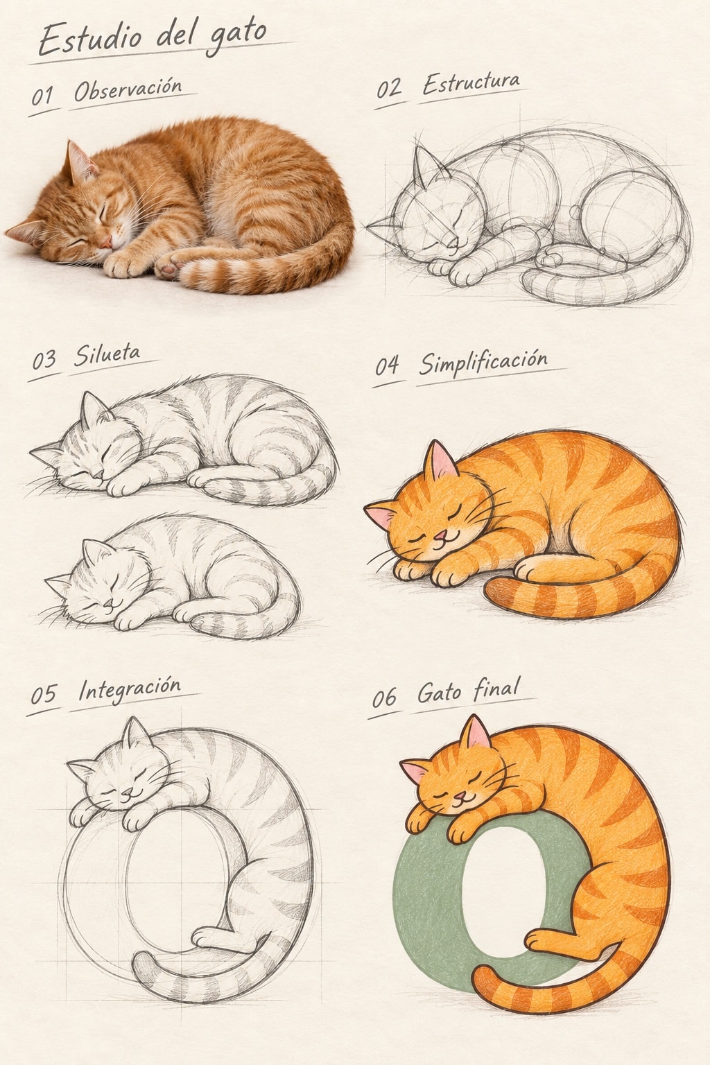
Punto is Dolores's imaginary cat — her co-CEO, her mascot, her signature. He doesn't exist in real life, but he needed to feel completely real on screen. Cocotasos developed Punto as a full brand character: personality, visual language, and a presence that could carry across social media, packaging, and digital touchpoints.
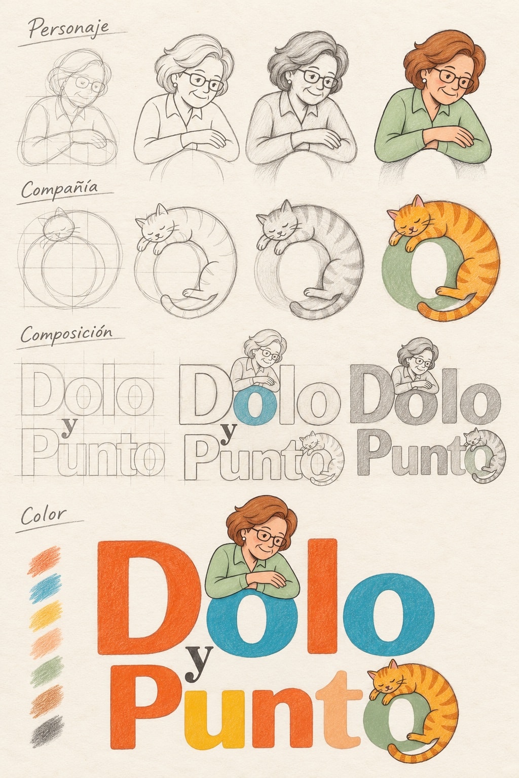
The process started with sketches — rough grids, gesture studies, proportions — before moving into refined illustration and finally full color. Punto went from a circle on a grid to a ginger tabby curled inside the final 'o' of his own name. He's not a mascot added on top of the logo. He's built into it.
Logo Design Process
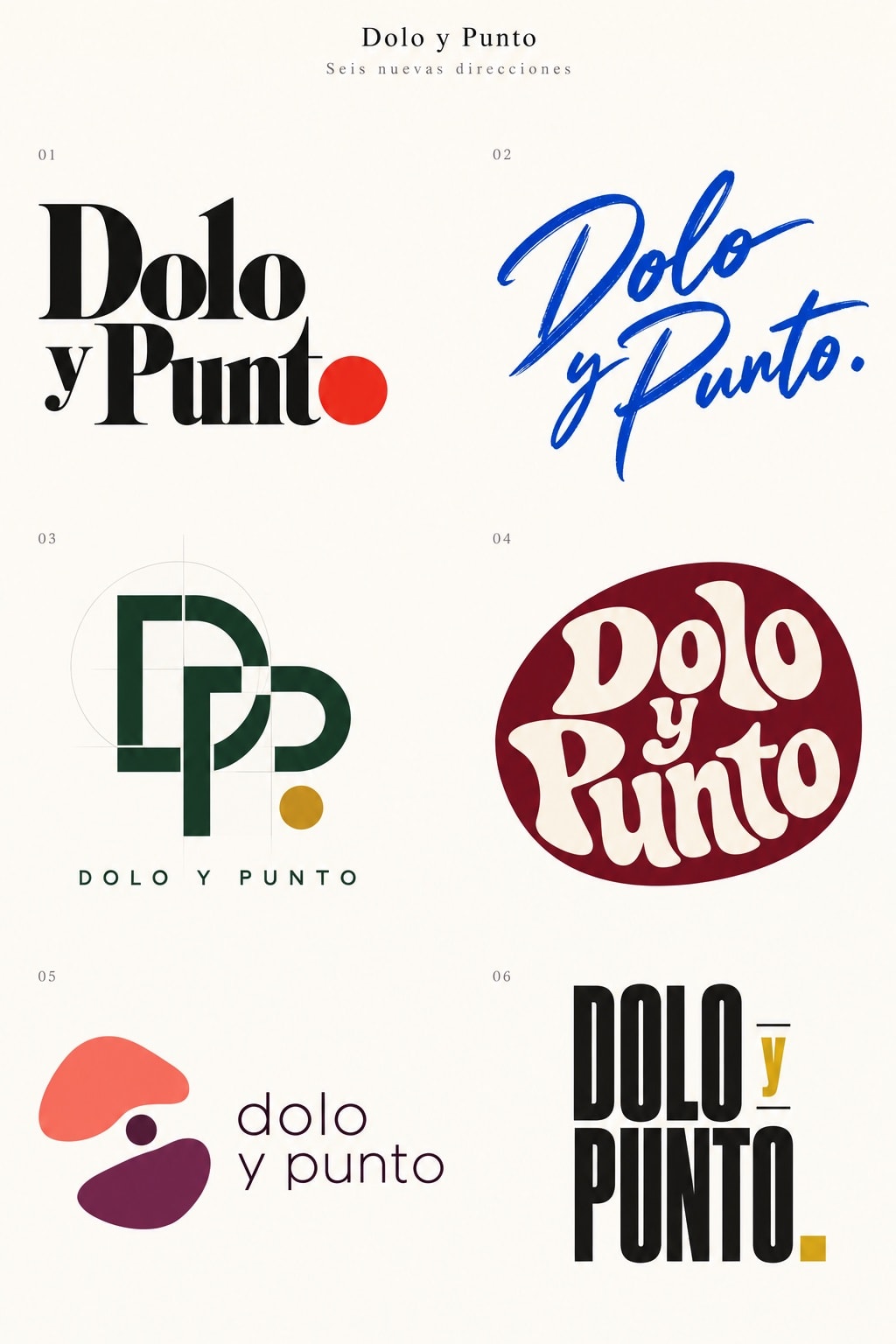
Six directions. One clear answer.
The process started wide — six distinct directions ranging from a clean editorial serif to a hand-lettered script, a geometric monogram, a retro badge, an abstract mark, and a bold all-caps wordmark. Each explored a different dimension of the brand: sophistication, warmth, playfulness, authority. The answer was already in the room.
Where You'll Find Her
TikTok
@doloypunto
@doloypunto
/doloypunto
YouTube
Dolo y Punto
Amazon Storefront
amazon.com/shop/doloypunto
Scope of Work
Color Palette
Warm, playful, and grounded.
Vibrant Orange
#E8541A
Primary — Dolores's energy, warmth, and boldness
Sky Blue
#4AABDB
Secondary — open, fresh, digital-native
Warm Yellow
#F2C94C
Accent — playful, optimistic, sun-bright
Sage Green
#7FAF6E
Supporting — calm, natural, home & lifestyle
Ginger Tabby
#D4823A
Punto's own color — warm, mischievous, unmistakable
Logo Anatomy
Built from the inside out.
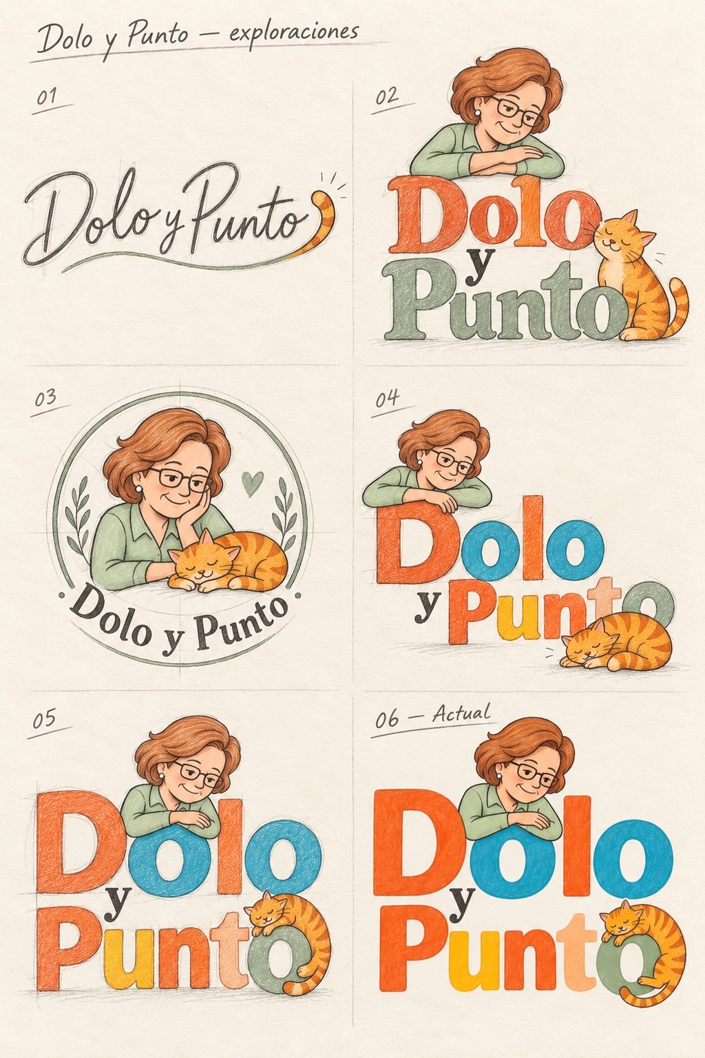
The final mark wasn't chosen from the six directions — it emerged from what they revealed. The brand needed warmth, character, and a personality you could feel before you read a single word. Cocotasos developed the illustrated logo through three parallel tracks: the Personaje (Dolores herself), the Compañía (Punto), and the Composición (how they live together in the letterforms).
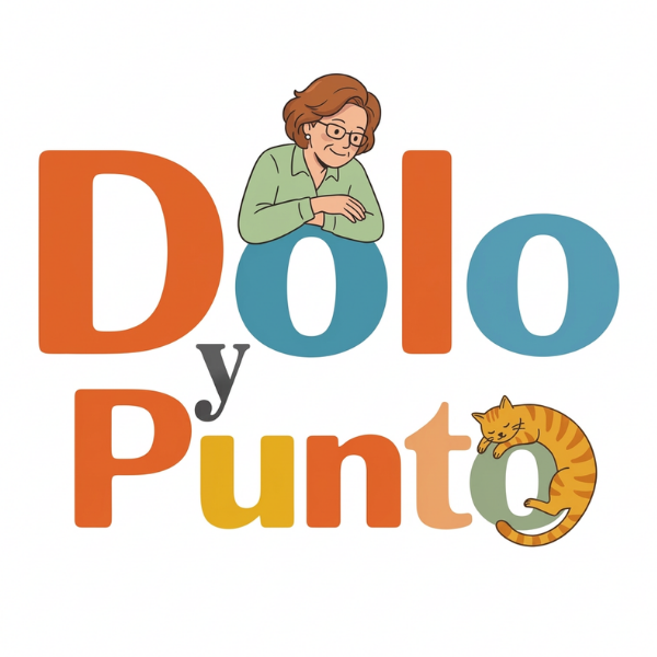
01 — Personaje — Dolores
Developed from rough gesture sketches through refined construction to full color illustration. Dolores leans on the letters with her arms crossed — confident, relaxed, completely herself. The brand is her.
02 — Compañía — Punto
Punto began as a circle on a grid and became a ginger tabby curled inside the final 'o' of his own name. He went through the same sketch-to-color process as Dolores — because he deserved the same care.
03 — Composición
Three composition studies tested how Dolores and Punto live inside the wordmark — from floating above the letters to leaning on them to being woven into the letterforms themselves. The final answer: both characters inhabit the type.
04 — Color System
Five colors pulled from the final mark and extended across the brand: vibrant orange, sky blue, warm yellow, sage green, and Punto's own ginger. Playful in combination, coherent as a system across every platform.