
Brand & Digital Experience
Buenavista Stays
"A home away from home — built to be found, trusted, and remembered."
Strategy
Brand Positioning & Messaging
Identity
Logo, Color & Typography System
Digital
Website, Booking & Calendar Sync
Platform
Airbnb STR Integration
A real host. A real brand. A real business.
The brief
Buenavista Stays is a boutique short-term rental business managed by Anabel — a second venture built alongside her primary work. The goal was a brand and website that could stand on its own: no reliance on third-party platforms, no generic listing aesthetic.
Anabel needed a presence that communicated the warmth and care she brings to every stay — something guests could trust before they ever arrived.
We built a complete identity system: a logo rooted in the imagery of home, sun, and water; a color palette that balances trust with warmth; and a direct booking website designed to convert curious visitors into confirmed guests.
Scope
- Brand Strategy
- Visual Identity
- Website Design
Live Site
buenavistastaysflorida.com →What we built
A full-stack brand and digital presence — from the first impression to the booking confirmation.
| Strategy | Visual Identity | Digital Experience |
|---|---|---|
| Brand Strategy | Positioning, audience definition, competitive landscape | Guest persona mapping, direct booking rationale |
| Visual Identity | Logo system, color palette, typography, brand guidelines | Property identity system, Blue Garden Studio sub-brand |
| Website Design | Direct booking site, mobile-first, SEO-optimized | Airbnb calendar & booking sync, availability integration |
| Copywriting | Voice and tone, page copy, guest-facing messaging | Listing copy, welcome messaging, review response tone |
Brand Palette
Colors built on trust, warmth, and escape.
Sky Blue
#0476D9
Off White
#FAFCFC
Warm Gold
#D59950
Olive
#667302
Deep Navy
#0C1D47
Logo Construction
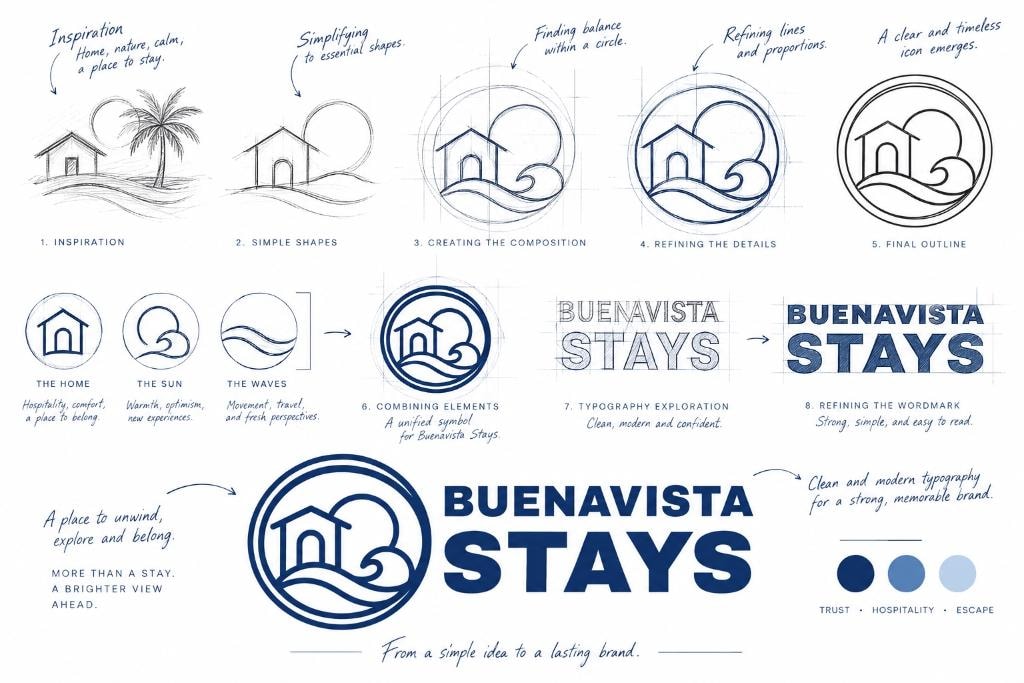
From a simple idea to a lasting brand.
The mark was built around three ideas — the home, the sun, and the waves — each carrying a distinct meaning: hospitality, warmth, and the promise of new experiences.
Strategy & Design
Warmth as a design principle.
Every decision — from the logo mark to the booking flow — was made to communicate one thing: this host genuinely cares about your stay.
Boutique hospitality for guests who want a home, not a hotel.
Warm, personal, and confident — like a host who's genuinely excited to welcome you.
Clean and inviting — navy and gold grounded in trust, cream and white for openness.
What our guests say
Real stays. Real stories.
A brand guests trust before they arrive.
Buenavista Stays launched with a complete brand system and a direct booking website — giving the business a professional identity independent of any listing platform.
A complete visual identity system — logo, palette, typography, and usage guidelines.
A direct booking website designed to convert first-time visitors into confirmed guests.
A brand voice and copy framework that communicates warmth and professionalism.
A digital presence built to grow — SEO-ready, mobile-first, and platform-independent.
A guest experience that begins the moment someone lands on the site.
A foundation for direct relationships — no algorithm, no commission, no middleman.
Property Identity
The Blue Garden Studio
Each property under Buenavista Stays carries its own identity — a name, a mark, and a personality that guests remember. The Blue Garden Studio was designed around the ironwork garden furniture that defines the space: ornate, romantic, and unmistakably its own.

The Blue Garden Studio
The ornate ironwork garden furniture that defines the outdoor space — roses, curves, and craftsmanship — translated into a mark that feels as considered as the property itself.
Romantic, intimate, and quietly elevated. A place for two.
Buenavista Stays is one of two businesses Anabel runs — and it needed a brand that could hold its own weight. Hospitality brands live or die on feeling. The best short-term rental sites don't just show you a space — they make you want to be there.
"The brand had to feel like the host: warm, thoughtful, and genuinely welcoming."
— Cocotasos Creative